A healthy business is one that is thriving with customers. Whether it is a brick and mortar business or some online shopping store, all of them are focused on maximizing their profit. A business creates a website either to inform their customers or sell their services or product online. Whichever the case is, the most important metric to measure their success is conversion.
Being Conversion Centric
For some businesses, conversion could mean, for example, how many people created an account on their website, for others it could be how many people purchased a product from their stores. Regardless of the case, conversion is an important metric that shows how well business is going.
Conversion is affected by various factors, for example pricing, promotional activities or content. For example, a sudden increase in price could result in less people buying your product, the usual demand and supply stuff.
The Cause and Effect
One of the most important factors that can affect conversion is website’s design. Why? Let’s say you visited Amazon.com, you like a pair of shoes and added to your cart. Now, a new page is loaded with four or five call to action buttons, wouldn’t it be confusing which button to click to proceed to checkout? This is a case of a bad design and as a designer it is your responsibility to understand a user’s need.
“The conversion rate measures what happens once people are at your website. Thus it's greatly impacted by the design and it’s a key parameter to track for assessing whether your UX strategy is working.”
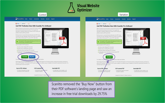
Source: 7 Common Pitfalls of Call to Action Design
Principles of a Conversion Centered Design
A Conversion Centered Design is where a landing page is designed by following principles of psychology, communication and persuasive design with the aim of moving the user towards a specific action. The purpose is to create high converting landing pages. For example, creating a landing page where user will land from a PPC ad to download an ebook after providing their name, email address or other information.
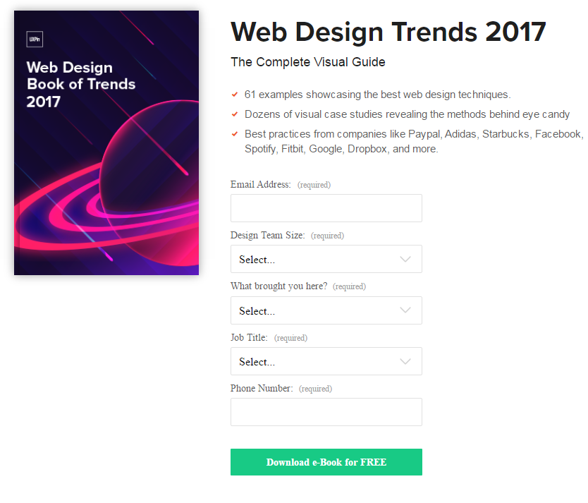
So, how you can use your design to persuade a user while incorporating psychological principles as well? Here are the principles of creating a conversion centered website design.
Encapsulation to Create a Focused Area

It is a technique where you create a tunnel like vision around a focus area to immediately catch user’s attention towards that area. You can use graphic elements, like a frame, or dull colors for the surrounding area, so the focus area is the most prominent area of the page.
This technique is particularly useful when you need to direct user’s attention towards a signup form or CTA, just like what Forgotify has done. They have brilliantly made use of dull light and dark background to makes the lighter colored CTA and the text on the foreground more prominent. The CTA catches our attention immediately.
Make an Element Stand Out Using Contrasting Colors
Selecting a color palette is probably the most important part of web design and when it comes to color ensuring a proper contrast is necessary. Contrast is the difference between the color used in the background and the foreground element. The best practice is to design a website with high contrast. The W3C guidelines also advise to ensure a contrast ratio of 4.5:1 for normal text. A complete guideline for contrast can be found on W3C Website. You can also use WebAim tool to check the contrast ratio on your website.
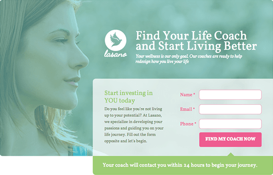
The principle of contrast becomes even more important when it comes to important areas of a website, like a CTA button. If there is a high contrast ratio between background color and foreground CTA, the CTA will be more prominent than other elements. This is what Lasano has achieved by ensuring high contrast. Their CTA clearly stands out from other elements on the page.
Direct User’s Attention Using Visual Cues

Sometimes providing a visual indicator is the most straightforward, yet effective method of directing user’s attention. Sometimes these indicators are as simple as an arrow, other times it can be subtle, like a person looking at the CTA button. This is just like when you enter a restaurant and the waiter points you to your seat.
Cut Through Clutter With Negative Space
In web design, negative space is a positive thing. A negative space is an empty space (or white space) between design elements. Even a space between two lines or two words can be counted as white space.

For example, this text would have been easier to read if there was more space between lines.
As you can see, ample white space can make your design more comfortable to look at. Along with that, white space can also help divert user’s attention to specific area.

Google homepage makes full use of whitespace to make the most important area of the page, the search bar and the two buttons, more prominent. This way, user can cut through the clutter and get right down to the business.
Create Urgency or Scarcity to Motivate Users
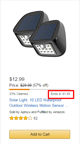
Urgency and scarcity are two psychological motivators that can be used to persuade your user’s to convert into lead or customers. By conveying to user that they have a short time to decide, you can make them more likely to convert.
This is what Amazon and other eCommerce stores often do with their deals. They create an attractive offer for a limited time or limited quantity. This gives consumers less time to think and make them more likely to buy, if they really need the product.
Try Before You Buy
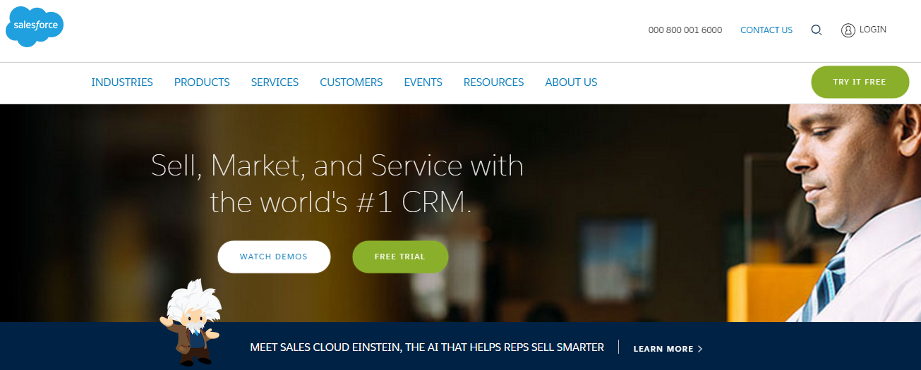
Giving a free trial to your product is a great way of getting more people aware about your brand and generating leads of prospects. Most of the PaaS and SaaS products provide free trial to their app, including Salesforce.
If your website is a service based, for example a design agency, you can provide a free consultation service which is an equivalent of “Try Before You Buy”. This is because the purpose of both is same. The prospect should get an idea of what they can expect from your product or service.
Social Proof
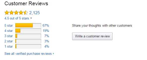
Social proof of your product or service plays a vital role in persuading your prospect to convert. I would be more likely to buy a product if it is recommended by two or more people who have similar interest like me. This is a common practice in ecommerce stores.
Conclusion
These are the basic principles that define a conversion centered website . You can apply all or any combination of these principles to create a landing page that will bring you maximum level of conversion. However, it should be ensured that the user experience of the page is not compromised in the process as UX has a significant impact on the conversions.
